
So, I made A Thing.
I’m BRAND new to calligraphy and illumination — like, traced stuff and painted it and called it good enough. And my calligraphy leaves a lot to be desired. I’ve been on the fence dithering about whether to enter the Queen’s Prize Tourney at the Middle Kingdom A&S Faire on Memorial Day weekend.
But.
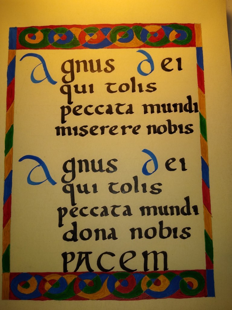
I got a Facebook notification that I was on a list to be called into Court at Kingdom A&S. Welp, that sealed the deal and thus the scramble was on. At first, I considered an SCA-specific scroll, but then realized that if it was terrible, I wouldn’t feel comfortable donating it as a blank, and if it was good, I would be too sentimental about my first decent C&I piece to donate it. That led me to consider what type of manuscripts most frequently survived until the 21st century — religious works. Early medieval Europe was predominantly Roman Catholic, so I decided upon a Latin prayer. I also needed it to be short, because time was of the essence. And did I mention I wanted to get everything done over the weekend, since I routinely work 60-hour weeks and have a household to manage?
I chose pergmenata (“perg”) because it was the closest thing to vellum/parchment that I could get for reasonable prices that wouldn’t terrify me to accidentally ruin. Gouache is the gold standard for those who don’t wish to make their own pigments. Once upon a time, I might have been that hardcore, but not these days.


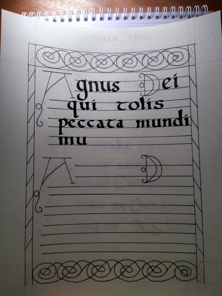
As I was cranking things out all day Saturday, I was getting pretty chuffed with myself, I mean, here I was with a nearly-complete page and it was only Saturday! Well, you know what they say about pride and falls…
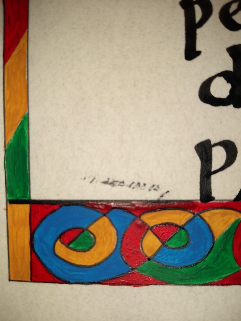
I managed to brush wet ink across an area of white space. I’s hit the paint, too, but more gouache helped to correct that little issue. The stark black on cream, though…. You know, I’d never had a panic attack before. Newsflash: They suck.

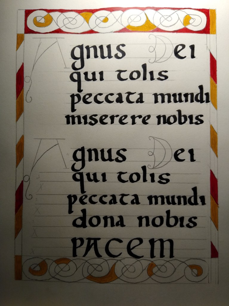
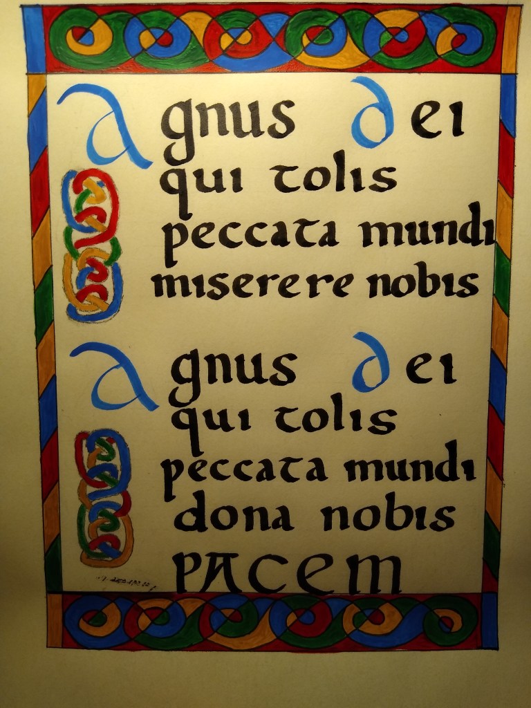
The knotwork was a last-minute addition to break up that white space below the As.
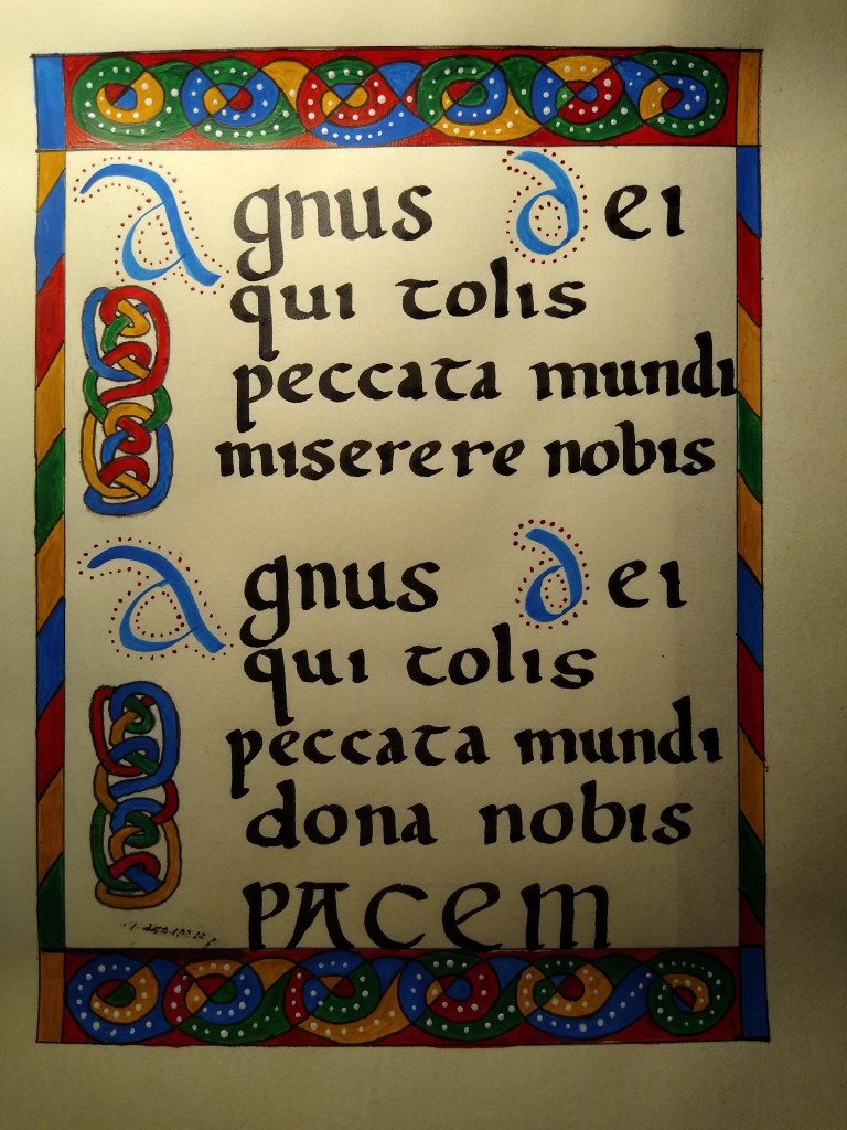
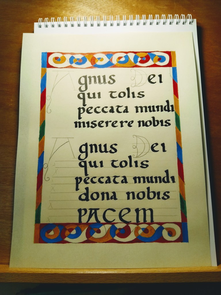
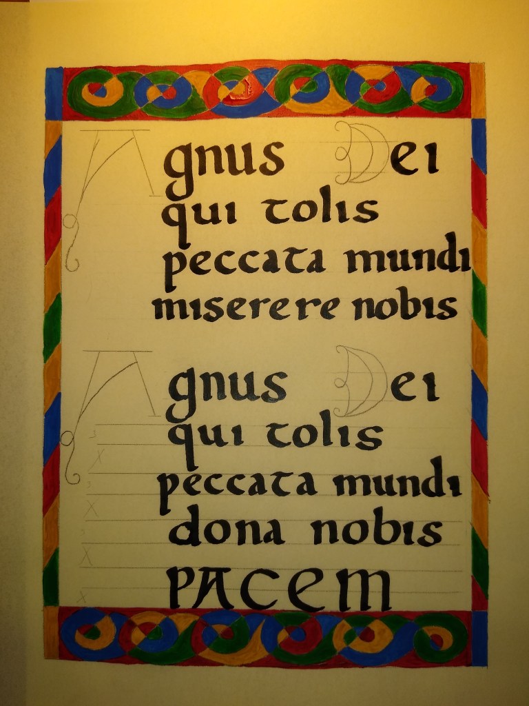
The red dots are called “rubrication” and I added the white dots mostly to help reinforce the interlaced effect of the borders. I still don’t like the smear of ink at the bottom, but you know what? I’ll live.
My first tournament entry.
